Welcome, You may have seen that there has been much written over the past few weeks about popular colour predictions for the year, so I thought I would take the opportunity to put my spin on it.
I guess Pantone is the most revered colour system throughout the world. This American based company has a colour matching system which produces a standardised colour reproduction system. Pantone colours are described by their allocated number and since the year 2000 the Pantone Colour Institute declares a ‘colour of the year’ – many ‘colour trending’ representatives meet to forecast what colours will be popular in the coming year. The colour chosen for 2017 is Greenery, a fresh yellowy-green shade – which after the uncertain times of 2016 represents growth, harmony, freshness…..

I have always shied away from using green in my interiors – once upon a time I painted a north facing room green, and it just felt too cold – and this has put me off using it – until now that is! Not that I would necessarily paint my walls green, but small steps at a time. Last year I started adding more houseplants to my home
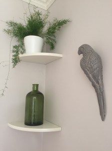
again this is all about bringing harmony and balance to our homes and neutralising our spaces against all of our electrical devices that we surround our lives with and will continue to be a huge trend in 2017. I will be looking to add some more plants during the year but one look I am hankering after at the moment is a green velvet sofa – I am seeing these pop up everywhere – in magazines, pinterest, other interior blogs –
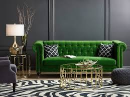


Not that in reality I can afford to change the sofas in my living room, but I do like this look – I love the first picture – the bright green really pops against the dark grey wall, but I have also seen pictures of a lighter green velvet sofa against a soft pink back drop that looked stunning – I can only dream……….
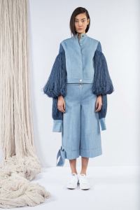
Dulux have chosen the colour Denim Drift as their colour of the year following their review of international architecture, fashion and design which revealed that blue is the colour of the moment.
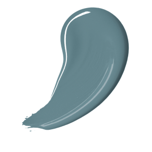
Dulux have also developed a colour palette of complementary of tones and hues as a fresh approach to combining colours. I do like this colour – quite contemporary and a good midway colour between light and the dark colours that are so popular at the moment. I notice upon flicking through my monthly magazines that there is also a lot of denim on the fashion pages too – of course denim never goes out of fashion – but new ways of wearing denim from jumpsuits to blouses, skirts and new shapes for our beloved jeans. It seems we won’t be able to escape it in 2017.
Just this week the wonderful Farrow and Ball paint company announced their stand out colours for this year. They believe that people will continue to embrace colour. They have picked 4 key colours for this year – including dark vivid hues Radicchio and Studio Green


and the subtler tones of Hay and All White. They believe these colours are suited to both contemporary and more traditional homes and have an enduring appeal.


It is interesting to see that green is coming through again, although this time in a much darker hue than Pantone’s Greenery, but dark wall colours do seem very on trend at the moment. I love this dark green kitchen:

I also love a dark red such as radicchio in a dining room setting – it provides an intimate cosy atmosphere which in turn must be good for feeding the soul- and the palette!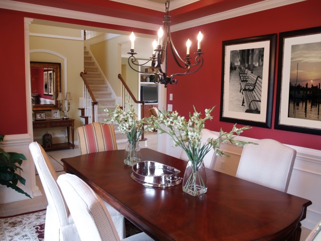
Until next time………
All images that are not my own from Google Images
