Homely Cosiness

Welcome, Here in the UK we have just endured a really cold spell of weather – waking up to harsh frosts each morning and the much berated defrosting of the car before starting out on our morning journeys.  However I am now trying to embrace these cold winter days – there is something to be said in the comfort of drawing the curtains or blinds in the late afternoon, shutting out the cold dark evenings and enjoying the ritual of lighting some candles and snuggling down on the sofa for the evening after changing into some comfy clothes and settling down with a nice warming drink and soft cushions and blankets.

The Danish term ‘Hygge’ has been much written about and its concept is being embraced by folk all around as we seek refuge from the daily grind of of work and commitments and teaches us to enjoy the moment spent in good company; to feel content and at ease.  It is about bringing a sense of balance and calm into your life.

img_2454

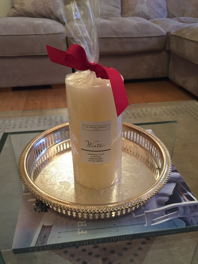
Candles are a relatively inexpensive way to bring around a sense of relaxed atmosphere into the home – their light is soft and soothing and a good scented one can give off a warming cacooning aroma that fills the house and makes for a relaxing atmosphere.  I love to burn the Winter candle by the White Company during the winter months.  It is infused with cinnamon, clove and orange and literally burns for hours.  It is also more soothing to have small pools of light to complement the candles – turn the overhead light off or have on a dimmer and have glowing lamps dotted around the house.  Make your surroundings homely with personal photographs and souvenirs and piles of cosy blankets and cushions.  Hanging out together in the kitchen is at the core of the ethos of Hygge.  Maybe drinking some wine whilst pitching in and making a meal with your loved ones and then sharing the fruits of your labour whilst enjoying each other’s company – this is the best way to keep those chilly nights at bay.  Indulge in some home cooking – a hearty warming homemade soup paired with some crusty bread is perfect for a weekend meal.

img_2450

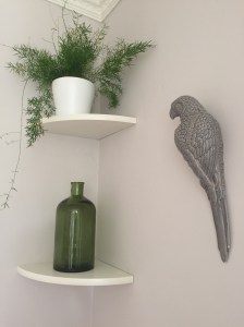
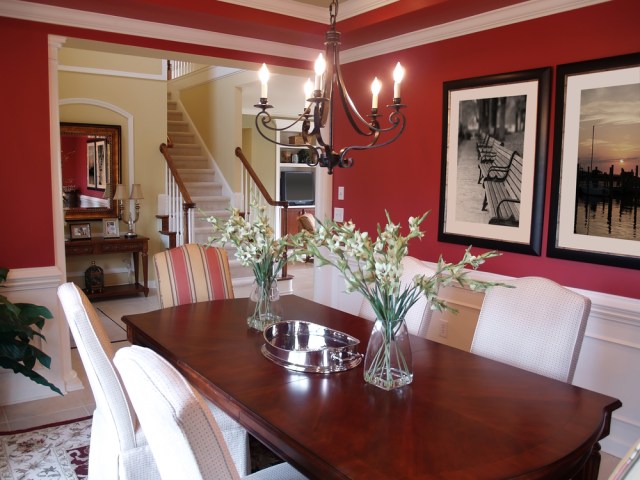
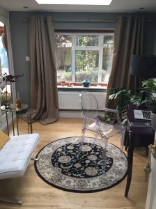
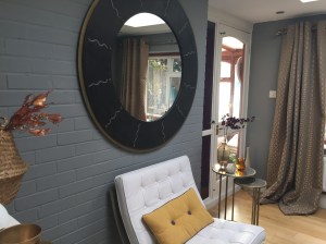
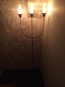
Some of my favourite Hygge images from the internet:


Of course to balance the snuggly cosy feelings of Hygge – it is also important to get outside and on a crisp sunny winter’s morning there is nothing better to get out for a good long walk to make the most of the rays of sunshine that are all too few and far between at this time of year.  Maybe the walk could even finish at a favourite country pub with Sunday lunch in front of a roaring fire!  After a bit of a lull I have started getting out for a run again and am enjoying the cold crisp weather especially when I know there is a nice bowl of hot porridge waiting for me at the end.  Here are some photos from a recent run – the frost makes everything look magical.


Of course, as much as most people I am looking forward to the first signs of Spring but with a positive outlook winter does not have to be something to be endured – we must make the most of each season enjoy the nuances of each one – so here’s to a happy Hygge:)


Colours for the year 2017

Welcome, You may have seen that there has been much written over the past few weeks about popular colour predictions for the year, so I thought I would take the opportunity to put my spin on it.

I guess Pantone is the most revered colour system throughout the world.  This American based company has a colour matching system which produces a standardised colour reproduction system.  Pantone colours are described by their allocated number and since the year 2000 the Pantone Colour Institute declares a ‘colour of the year’ – many ‘colour trending’ representatives meet to forecast what colours will be popular in the coming year.  The colour chosen for 2017 is Greenery, a fresh yellowy-green shade – which after the uncertain times of 2016 represents growth, harmony, freshness…..

I have always shied away from using green in my interiors – once upon a time I painted a north facing room green, and it just felt too cold – and this has put me off using it – until now that is!  Not that I would necessarily paint my walls green, but small steps at a time.  Last year I started adding more houseplants to my home


img_1463

again this is all about bringing harmony and balance to our homes and neutralising our spaces against all of our electrical devices that we surround our lives with and will continue to be a huge trend in 2017.   I will be looking to add some more plants during the year but one look I am hankering after at the moment is a green velvet sofa – I am seeing these pop up everywhere – in magazines, pinterest, other interior blogs –

green-sofa-1


Not that in reality I can afford to change the sofas in my living room, but I do like this look –  I love the first picture – the bright green really pops against the dark grey wall, but I have also seen pictures of a lighter green velvet sofa against a soft pink back drop that looked stunning – I can only dream……….

Dulux have chosen the colour Denim Drift as their colour of the year following their review of international architecture, fashion and design which revealed that blue is the colour of the moment.

denim-drift

Dulux have also developed a colour palette of complementary of tones and hues as a fresh approach to combining colours.  I do like this colour – quite contemporary and a good midway colour between light and the dark colours that are so popular at the moment.  I notice upon flicking through my monthly magazines that there is also a lot of denim on the fashion pages too – of course denim never goes out of fashion – but new ways of wearing denim from jumpsuits to blouses, skirts and new shapes for our beloved jeans.  It seems we won’t be able to escape it in 2017.

double-denim-fashion-looks-2016-2017-7


Just this week the wonderful Farrow and Ball paint company announced their stand out colours for this year.  They believe that people will continue to embrace colour.  They have picked 4 key colours for this year – including dark vivid hues Radicchio and Studio Green


and the subtler tones of Hay and All White.  They believe these colours are suited to both contemporary and more traditional homes and have an enduring appeal.


It is interesting to see that green is coming through again, although this time in a much darker hue than Pantone’s Greenery, but dark wall colours do seem very on trend at the moment.  I love this dark green kitchen:

dark-green-kitchen

I also love a dark red such as radicchio in a dining room setting – it provides an intimate cosy atmosphere  which in turn must be good for feeding the soul- and the palette!dark-red-dining-room


Until next time………


All images that are not my own from Google Images


Snug Room Make-over

Welcome, apologies that several weeks – and more time than I would have hoped – have yet again past since my last post……they have passed by in a haze of learning a new job, getting to know our new puppy, Christmas and… decorating!  Yes, I have finished painting my ‘snug’ room and am pretty pleased with the result!

img_2328


Before I go any further, here are some before pictures:


In the past I have been an advocate for painting my rooms in light colours – in fact at one time I wanted to paint the whole house white!  But more recently I have been embracing the dark side – maybe it is the time of year but there seems to be a whole movement on the pros of decorating our rooms dark, comforting colours.

img_2330

The main advocate for this school of thought is Abigail Ahern – she is a stylist and designer who runs her own shop, website and blog.  During the summer when I was in London I went to visit her shop in Islington and although not huge it was stuffed with sumptuous rugs, cushions, furnishings that had plenty of colour and texture and I was smitten.  She also has her own paint range and as well as advising on painting rooms in these bold, dark colours, she recommends that you paint the ceiling the same colour to really immerse yourself and make the room one whole.  I was tempted to try this but was a little worried that the room would look out of place as all the other ceilings in my house are white and I knew from the start that hubby would find this idea one step too far, but can see her wisdom behind her thinking – her shop is painted dark grey with the colour being taken onto the ceiling and I think it looked fab!  A link to here website is here Abigail Ahern.  She also sells a range into Debenhams if you so happen to like quirky velvet covered animal lamps and cushions.

I had been tempted to cover one wall in wallpaper as a nod to a feature wall, but after many hours of looking could just not find one that I liked in my price point.  Another blog that I follow, Swoonworthy where the writer Kimberley has decorated her dining room this year has a feature wall of mesmerising wallpaper,but when I researched this and found it was nearly £100 per roll it was just out of my budget.  I figured that as there is a brick wall in the room (that is painted) I didn’t want too many styles and features as it is quite a small room.

As for colour – I have gone with Farrow and Ball paints – my little bit of luxury – all made in Dorset and a lovely texture.  After going through several tester pots I settled for Plummet – a lovely dark grey – this room has undergone several transformations since living in the house – from children’s play room, to teenage hangout den to office – and most lately it had been painted white – when I first painted the above mentioned brick wall I was a little nervous – but I knew painting it white was fairly safe – but now painting it dark grey I was unsure, but am so pleased I bit the bullet.  The room is definitely feeling much cosier.  I also had a grey wooden desk in the room but it was the wrong shade of grey – too insipid, and so I decided to paint it in a dark aubergine gloss which looks amazing alongside the dark grey.

So now the hard work was done, it was time to add the fanciful pieces.  For the most part I have repurposed the pieces that I already had – just a change of position here and there – it has made all the difference.  I have purchased a couple of side tables from Next that fit the room perfectly and have also gone to Next for some curtains and curtain pole.  My idea was for the curtains to ‘pool’ onto the floor but they are a bit long even for that and so will have them taken up a touch in the new year.

I am using a copper colour as my accent and hope to gather a few bits over the coming weeks.

The old rug has gone back down for the moment, I quite fancy a cow hide in the room but again am mindful that it might just look too much in the space so I shall wait and see.  The item I am stuck on at the moment is a bookcase.  As our house was built at the beginning of the 1960s I thought that I should aim to obtain a piece from the era to add a bit of nostalgia to the room – recently I went to a large antique centre but there was little to choose from and after ploughing through e-bay and the internet for hours I still have not found a piece to suit.  I don’t really know what I am looking for but it is one of things that I will know it when I see it.  I am now of the mind that I may have to buy something new that is styled in the modernist way.  So watch this space…….

Just prior to Christmas I also decorated the small room that leads into my new snug, this leads out from the kitchen and it has always just been a walkthrough, or somewhere that the dogs hang out!  Again this was painted white and I have gone for ‘Brassica’ – another Farrow and Ball colour which I think looks perfect when looking through into my snug room – I will just give you a sneak peak of the colour as it looks on the wall, as I have yet to style this room – again I am looking for some nice mid-century (if possible) furniture – a display cabinet is what I have in mind – I may also add curtains and a large picture – so I don’t want to reveal the whole room just at the moment – I think it could take me a couple of months to save up and source the pieces – so hope to bring this to you in the Spring.  Notice how the colour looks different in the photos below dependant on the light and shade:)

To finish up for today, I would just like to say that although my blog tailed off towards the end of last year, I am hoping to be more prolific in the weeks to come and to get back on track once again.  So, until next time…………